Email is a vital communication tool for federal employees to transmit agency official communication. To ensure all federal employees have access to information contained within and attached to email messages, we must ensure the emails meet Section 508 Standards. Below are easy steps to create accessible email messages so all individuals, including those with disabilities, can easily read, understand, and interact with the content.
It’s important to note that modern email software increasingly offers users the ability to format messages using styles and tools similar to those found in document authoring tools. For example, Microsoft Outlook offers an HTML format similar to Word. Some email messages use plain text format and do not allow for images or other design features, therefore the tips outlined in this guidance may not apply in all circumstances.
Step 1: Write your email
The subject and body of email messages should clearly and concisely state the purpose of the message. The author should use plain language appropriate for the intended audience.
Know Your Audience
One of the most popular plain language myths is that you have to “dumb down” your content so everyone can read it. That’s not true. The first rule of plain language is to write for your audience. Use language your audience knows and easily understands. Take your audience’s current level of knowledge into account. Don’t write for an eighth-grade class if your audience is composed of doctoral candidates, small business owners, working parents, or immigrants. Only write for eighth graders if your audience is, in fact, an eighth grade class.
However, because you may be communicating with agency staff members or members of the public, do not assume they know what you are talking about or are familiar with jargon you may use daily.
Writing Styles
Plain language improves accessibility and works with whatever style you follow. Below is a summary of the Digital.gov Style Guide and 18F Style Guide used at the General Services Administration (GSA); they are similar to many of the federal government style guides and other writing guidelines available on plainlanguage.gov. These guidelines show employees how to write electronic content such as email messages, documents, and web pages.
- Abbreviations and acronyms - Acronyms often confuse readers. Avoid them whenever possible. If an acronym is necessary for future reference, spell the full word and follow with the acronym in parentheses on the first reference. For example, the General Services Administration (GSA).
- Active voice - Our writing should be concise and direct. We prefer the active voice because it supports brevity and makes written content more engaging.
- Capitalization - Follow a consistent capitalization scheme. Inconsistent spellings and capitalizations undermine your narrative authority.
- Inclusive language - The words we use make the difference between forging positive connections and creating distance in our personal and professional lives.
- Names - Use full names on first reference. On second reference, use first names when writing about our teams or our work, and otherwise follow AP style (which is to mostly use last names on second reference).
- Numbers, percentages, and dates - In body copy, spell out numbers one through nine and use numerals for numbers 10 and greater.
- Punctuation - Capitalize the first word of every bullet. Don’t use semicolons after points in a bulleted list. Include a period at the end of the bullet only if that point is a complete sentence.
- Specific words and phrases - As with other style rules, we use rules for the accepted forms of common words and phrases for capitalization, hyphenation, and punctuation.
- Technical writing - In most cases, it’s safe to say the reader is learning something new or troubleshooting, therefore you need to write clear, concise instructions for the best possible experience.
- Trademarks and brands - Avoid using a trademark unless you’re referring to a specific product.
- URLs and filenames - It’s important to remember users of screen readers will often skip from one link to another, skipping the text in between, as a way of skimming for the content they need. For filenames, use hyphens to separate words, just as with URLs. Lowercase filenames are better because it’s easier to type and to remember.
- Voice and tone - Our voice is our unique personality. You should think of your written voice as analogous to your actual tone of voice. Tone is more like attitude—the emotional context of a piece.
Things to Avoid
- Generic or nondescriptive message subject that is not searchable
- Passive voice
- Abbreviations and acronyms unless the full word is followed with the acronym in parentheses on the first reference
- Italics
- Technical jargon and unfamiliar terms
- Run-on sentences, long paragraphs, and meaningless filler phrases
- References to shape, size, sound, color, or location
- Abbreviating the month or using numbers as in 10/22/2005. For formal writing, spell out the full name of the month and use the four-digit year such as October 22, 2005
- Images in the signature block, other than required by policy
- Email stationery, as with Microsoft Outlook, or layouts, as with Google Gmail
Step 2: Use the Accessibility Checker
Microsoft Office authoring tools, including Outlook, have a built-in Accessibility Checker under the “Review” tab in the navigation ribbon. Enable this tool at the outset of creating your email and frequently check for and resolve errors.
The Accessibility Checker helps create accessible emails by identifying potential issues for people with disabilities in reading content or using the document. Regardless of the recipient, all failures must be remediated before sending the email. If you generate a great deal of email, you may want to add the “Check Accessibility” button to the main authoring ribbon or quick tools section.
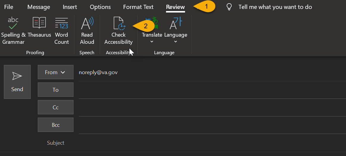
- Go to the Review tab (keyboard Alt+v).
- Click on the Check Accessibility button (keyboard a or Alt+a).
The online version of Outlook also allows you to check accessibility.
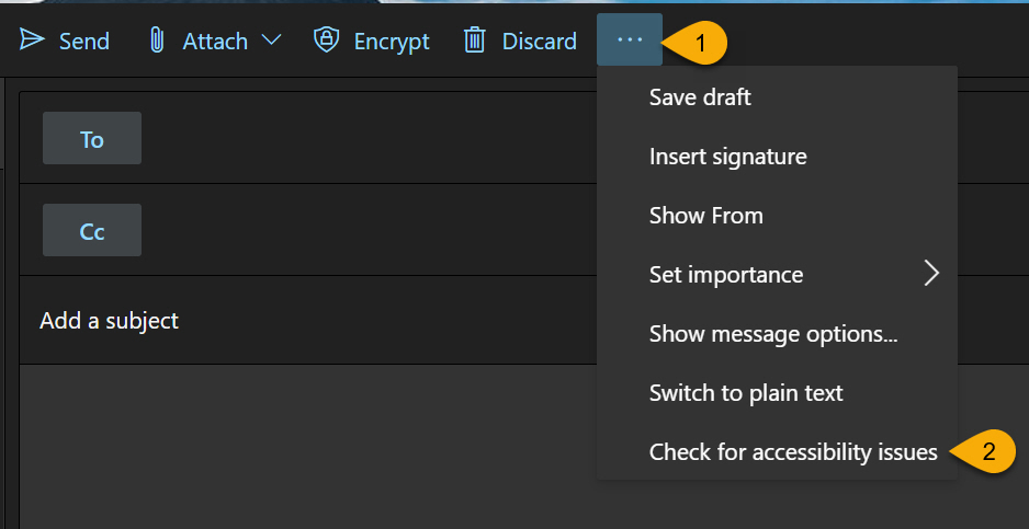
- In the main toolbar, click more actions, which is visually represented above with three dots
- At the bottom of the options, click “Check for accessibility issues.”
Step 3: Ensure Text and Images Provide Sufficient Contrast
An important aspect of color for both low vision and colorblind users is sufficient contrast between the foreground text and the background.
Federal government electronic content must meet Section 508 Standards, which incorporates Web Content Accessibility Guidelines (WCAG) version 2.0 A and AA criteria. All government emails, documents, and websites must meet a minimum AA rating, and should meet AAA wherever possible.
By default, email messages use a style of black text on a white background. Unless you have the ability to test for contrast, these settings should be unaltered. If you are able to determine or test for color contrast, make sure that the contrast ratio is 4.5:1 or greater.
Never use color as the only method of meaning or emphasis. If your audience has certain color blindness, they may not be able to see the color you chose. Also make sure to bold text or use text or symbols in addition to color in images and tables to ensure your information and meaning is clear to all.
Additional Color Resources
- Using Color | U.S. Web Design System (USWDS)
- WebAIM: Color Contrast Tool | WebAIM
- Accessible Palette Builder | Toolness.github.io
- Contrast Grid | Eightshapes.com
Step 4: Add Alternative (alt) Text to Images
Images are a wonderful way to draw attention, build on a story, and provide visual reinforcement to a concept you are trying to explain. However, if your audience has a vision impairment that prevents them from seeing the image clearly or at all, you need to provide a text description of that image. Alternative text, also known as alt text, is descriptive text that conveys the meaning of an image in digital content. When a person uses assistive technology such as a screen reader, the screen reader will read the onscreen text aloud.
Alt Text
To minimize the frustration and increase understanding, images intended to convey meaning must have a textual equivalent. Fortunately, documents created in email can take advantage of an alternative text attribute—commonly referred to as alt text. Alt text is intended to provide the textual equivalent of the image, which then allows screen readers to convey the meaning to the user.
General Guidance for Alt Text
- All images must have alt text or be marked as decorative.
- Images intended to convey meaning must have a textual equivalent available.
- Avoid text on images and do not use images that are just text.
- Alt text should consider the context in which the photo is being used and be as meaningful as possible.
- Describe the image, such as, “Group of people at an airport.”
- Keep the alt text clear, meaningful and concise. Due to screen reader behavior and general usability, the text should be limited to less than 250 characters. If longer text is required to convey the message, use captions or the surrounding text and then in the alt attribute use very basic text.
- End alt text with a period. This signals the screen reader to pause before proceeding.
- If the image is just decorative and conveys no real meaning, use the “Mark as decorative” checkbox in Microsoft Office. Minimize the use of decorative images; they can be a distraction and they increase the file size.
- If the image is a hyperlink without any text, it must have alt text. If the link includes the image and text, then the empty alt can be used to avoid redundancy.
- Do not use “a picture of,” “an image of,” “a photo of,” “the so-and-so icon,” etc.
- For Microsoft Word, place any alt text in the Description field, not the Title field of the Format Picture dialog.
- Manually check that all alt text is entered correctly. Microsoft auto-generates alt text for images, but it should not be used unless it has been verified to be correct.
Other Resources
- Authoring Meaningful Alternative Text
- World Wide Web Consortium (W3C) Alt Techniques
- WebAIM Alternative Text
Step 5: Provide Descriptive Links and Hypertext
Hyperlinks should tell people what action to take, where to go next, or what information to expect when they select the link.
General Guidance for Hyperlinks
- Avoid generic terms and phrases such as “Click here,” “Learn more” and “Read more.”
- Create link text that’s as specific as possible. For example, use “Download the FY24 annual report” instead of using “Click here.”
- Create hyperlink using the most relevant word or phrase.
- The link text should make sense out of context. Users navigating via screen readers often jump from link to link.
- Avoid using URLs as link text as they can be confusing and difficult to read, especially for screen readers.
- Make sure the voice and tone of your link text match those of the rest of the content to create a more consistent experience.
- Include information about what a link leads to; this is especially important for mobile device users. For example, if you’re linking to a PDF, use “Download the FY24 annual report (PDF)” instead of “Download the FY24 annual report.”
Link and Hypertext Resources
- Accessibility Bytes No. 4: Descriptive Links and Hypertext
- 1.1.1 Non-text Content
- 2.4.4 Link Purpose (In Context)
Step 6: Use Proper Text Formatting and Styles
When creating emails, use approved agency fonts—not background images or stationery—and heading levels to break up sections of text.
Neither WCAG or Section 508 specifies typefaces or a minimum font size for email messages. However, government email needs to have clear and consistent headings and highly legible text.
In general, when using built-in features, we recommend:
- Standard sans-serif fonts such as Public Sans, Segoe UI, Roboto, Verdana, Arial, Tahoma, or Helvetica
- Text that is at least 10 to 11pt (13 to 15px)
- Black text on a white background to ensure the appropriate color contrast
- Bulleted or numbered lists using the built-in list tools
- Paragraph text that is left justified. Full justification should be avoided.
- Where Heading styles are used, apply the proper Heading level for the content structure, such as Heading 1, Heading 2, or Heading 3, and not how the heading looks.
Additional Text Resources
- Understanding Accessible Fonts and Typography for Section 508 Compliance
- Font | U.S. Web Design System
Step 7: Accessible Tables in Email
Tables can be very difficult for screen readers to understand unless there is a clear relationship between the header and data cells. Not all email software offers built-in tools to create tables.
Where available, use the built-in “Table” tool to insert simple data tables with one row of column headers and no nested rows, columns, or merged cells, and indicate header and row columns. Avoid blank rows, columns, and cells, or using tables for layout or formatting purposes, such as formatting a numbered list.
Step 8: Simplify Your Signature Block
A signature block that does not contain images or hyperlinks are more accessible than those with images and hyperlinks.
Federal agencies typically have a policy regarding staff email signature blocks. Locate and follow this policy. If your agency does not have such a policy, your email should include your name, the name of your agency, your government telephone number, and government email address, and be used for all new and response messages.
If you place an image in your signature block, such as the OIT signature logo, use alt text to convey the meaning of the image. For example, enter ”Department of Veterans Affairs Office of Information and Technology” for the alt text to describe the OIT signature logo.
Images with hyperlinks are acceptable as long as the alt text associated with the image describes the meaning or intent of the image so the reader knows what to expect if the link is activated. For example, the alt text for the Facebook logo linked to the Department of Veterans Affairs’s Facebook page is ”Visit the VA Facebook page.”
Things to Avoid Placing in Your Signature Block
Government emails signatures blocks should refrain from using:
- Cursive or fancy typefaces and fonts
- Slogans and personal or extraneous messages
Step 9: Verify email attachments are accessible
Documents attached to email messages that are public facing or agency official communication must conform with applicable electronic document standards.
Attachments should use a unique and descriptive file name.
Emails that include attachments must contain accessible attachments or include in the body of the email the information contained in the attachment.
For instance, when a memo needs to be distributed, the current method is to attach the memo to the email with a note making reference to the attachment, such as“open attached memo.” The majority of memos are sent out as scanned .tif or .pdf image files. Screen readers cannot read scanned image files.
To ensure accessibility with attachments, use one of the methods described below:
- Ensure the attachment is accessible prior to distribution.
- Include a link in the email to an accessible format, such as HTML, of the document; this is referred to as a conforming alternate version.
- Scanned documents processed through an OCR program—if the user has OCR software—can be made accessible using Adobe® Acrobat DC® and similar software to add necessary structure and style including headings, text, tables, alt tags for graphics and graphics, and signatures. As these types of files are accessible, it is not necessary to include a conforming alternate version.
Where an accessible attachment is not technically possible, use the methods below:
- Attach a nonconformant document such as a scanned .tif or .pdf file and insert the text of the memo in the body of the email message to match the .tif or .pdf file. Include a description of the attachment at the bottom of the email, such as “Attachment — Veterans Day Scanned Memo.”
- In addition to a scanned document, provide an additional attachment that is Section 508 conformant. Include a description of the attachments at the bottom of the email, such as “Attachment 1 – Accessible Veterans Day Memo, Attachment 2 — Scanned Veterans Day Memo.”
Things to Avoid When Attaching Files to Email
Urgency and lack of planning are not sufficient reasons for sending or distributing inaccessible attachments.
- Not drafting and creating electronic content with accessibility in mind.
Additional Resources
- Checklist for Accessible Email
- Minimize Abbreviations | plainlanguage.gov
- Keep It Jargon-free | plainlanguage.gov