Do you know that some people experience difficulty understanding and comprehending information when we use only colors to convey it?
The previous Accessibility Bytes discussed how the colors we used for text may make it difficult for some people to read or understand the information in a document, webpage and video captions.
Meeting the use of color requirement ensures color is not the only visual means of conveying information, indicating an action, prompting a response, or distinguishing a visual element. While color can be used, another visual method, such as a pattern or text label, should be used to convey information.
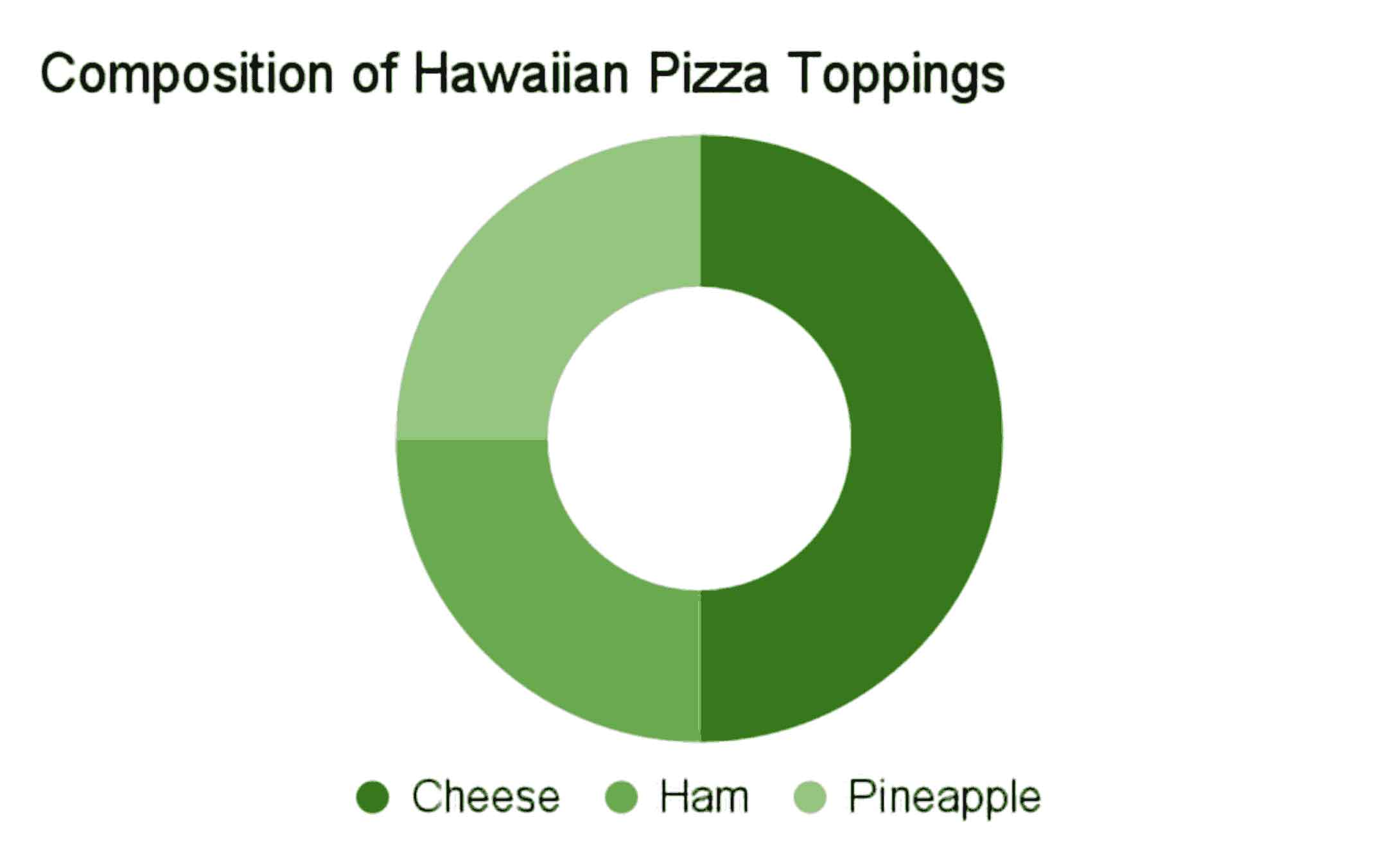
The following two images are an example of a nonconformant and conformant chart showing everyone’s favorite pizza topping combination—cheese, ham and pineapple. Figure 1 below is a doughnut chart using three shades of green with a legend at the bottom of the chart with the words cheese, ham and pineapple next to a small circle containing the sample color for the corresponding topping within the chart. No labels or text are used to describe each section.

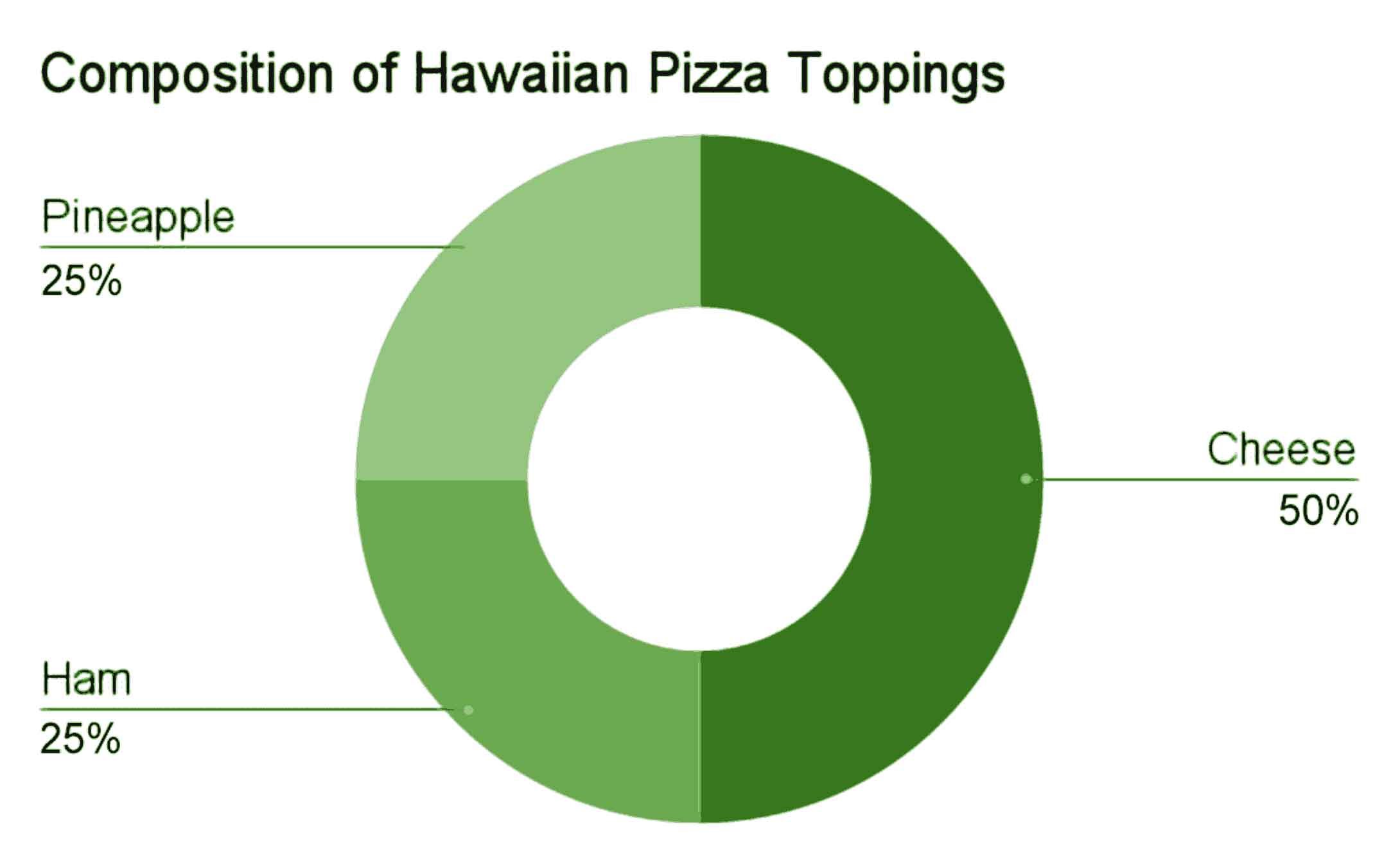
In Figure 2, the same doughnut chart is shown except this time the legend has been replaced with labels describing each section along with the percentage of each topping. There is even a line from the label to the topping section in the chart to ensure understanding and comprehension.

While there may be discussions and debates about Hawaiian pizza for years to come, there is no dispute how simple it is to ensure everyone can understand this chart by avoiding the use of color alone to present meaningful content or instructions.
For more information on color standards, see:
- Functional Performance Criteria 302.3 Without Perception of Color | USAB
- Module 11: Use Color and Other Sensory Characteristics Plus Text to Convey Meaning
- WCAG 1.4.1 Use of Color | W3C
- WCAG 1.4.3 Contrast (Minimum) | W3C
Still have questions? Reach out to your agency’s Section 508 Program Manager or contact us at Section.508@gsa.gov.
Reviewed/Updated: July 2024


